Design principles
Proportion

Proportion is a relationship of one part to
another or to whole with the size quantity or degree and ratio.
Unity

Unity is a work of art that interrelates
balanced and organized to achieve quality of oneness.
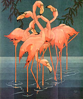
In the example above the artist has closely grouped together similar
objects (birds) and used proximity to create a sense of unity. Unity is
also achieved through the use of colour, having all the flamingos
share a similar colour.
Rhythm

This
design principle is created when the artist uses one or more of the elements of
design repeatedly in order to create a sense of organized movement.
Variety is key to keep rhythm in art exciting and active. Rhythm
also benefits the art work by moving the eye of the audience around your
artwork. As in the picture it shows the repeated wave line by the shore.
Emphasis
Emphasis
is an accent, stress or importance placed on a part of a piece of artwork or
photos. As in the picture above i took the picture of a grass but only emphasis the flower because
only the flower stand out and the rest is blur.
Balance
Symmetrical
Symmetrical
balance is achieved when both sides of an artwork carry the same visual weight.
Symmetrical balance gives the impression of stability in a visual sense.
As in like the picture of Taj Mahal it is built symmetrically.
Asymmetrical

Asymmetrical
balance is achieved when the visual weight of the objects in the art work are
not the same. As in the picture above the “pawns” on the right is not same with
the “King” on the left. But somehow the picture seems balance because the
differentiation of the size.
Radial
Radial
balance parts radiates from the center in all direction. As in the picture
shows radial Balance because the identical units, or the bars, are arranged
around a common point.

No comments:
Post a Comment