Color
Color relationship:
-
Warm – Consist a range
of color from red till yellow which also
included brown and tan. Mostly
use to create a warm,
cheerful and active in a
painting, and can be used to
stimulate or aroused the viewer.
-
Cool – Completed by a
range of color from green to violet and
gray included. Use to create the
feeling of calm and relax
and are tends to be more recede compare to warm color.
Analogous color:
-
Color that are adjacent
to each other on the color wheel. Some examples are green, yellow green. Often
can be found in nature and are pleasing to look at. This combination gives
bright effect within the area and is able to coup with several moods. Always
make sure there is one hue as the main color when applying analogous color.
 Mark
Nestmite
Mark
Nestmite
This painting is done by an analogous
scheme based on the color blue. The story behind this painting is inspired
during a hiking with the painter’s own family at Lake Mineral Wells. The color
blue was use because the painter wishes to capture the cool breeze and cold
feeling after a long day. This also show the mood of the painter when he was
doing his painting.
Complementary color:
-
Colors that are
opposite to each other on the color wheel, such as blue and orange. It is use
to create a more energetic feeling. The high contrast creates a vibrant view
especially during full saturation.
The
lake at sunset, Connie Mulloy
This painting is complete with 3 color
which is the thalo blue, cadmium yellow and cadmium orange. This painting has
not much of a meaning behind it but the usages of complementary color are quite
obvious and are easy to see. The painter also use some white color just to make
the yellow and orange more clear and fresh from each other.
Split-complementary color:
-
Have a main color and
two color each side of the opposite color on the color wheel. These color are
one hue and two space from its opposite. Mostly uses in presentation using a
computer in order tom maintain high contrast and avoid fatigue.
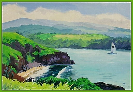
Sailboat,
Donald A. Jusko
This painting was done in a high
perspective with the color purple and green to make the distant look and the
foreground was color by magenta and green. The cloud edge of the sky was being
smeared by the painter to determine the location of the sun, which is in the
left.
Color intensity:
- Known as the strength or
the purity of a color in same color type. Also include as a low, middle and
high key value of a color.

Rainbow
bright, Kate
A painting that is completed using color
straight out of the color tube without adding any mixture. The colors are
mostly in high intensity or high key value and thus create an abstract type of
painting.